-->

Sunday, October 26, 2014

On pants

My older child has the tendency to want things just so. Just as they have always been. Not being one to embrace change in any way, we've had some issues with her wardrobe - the size 5 sweatshirt she's been trying to wear up until last fall comes to mind... the socks that are worn through at the heels because she has turned her nose up at every proffered replacement.

At any rate, she's well into elementary school, and all the stores are full of jeans. We've never pushed jeans, because on little kids, they're kind of silly. So, she's been wearing knit pants, mainly from Gymboree, which are bright, in fantastic patterns, and I guess they stopped selling them a few years ago.

Right now, it seems the stores are full of jeans and leggings, and you can't find pants to save your life. But you can't tell that to my kid, because she wears pants. So, well, faced between my kid's stubborn streak and the desert of the mall, where else does one go but the fabric store?


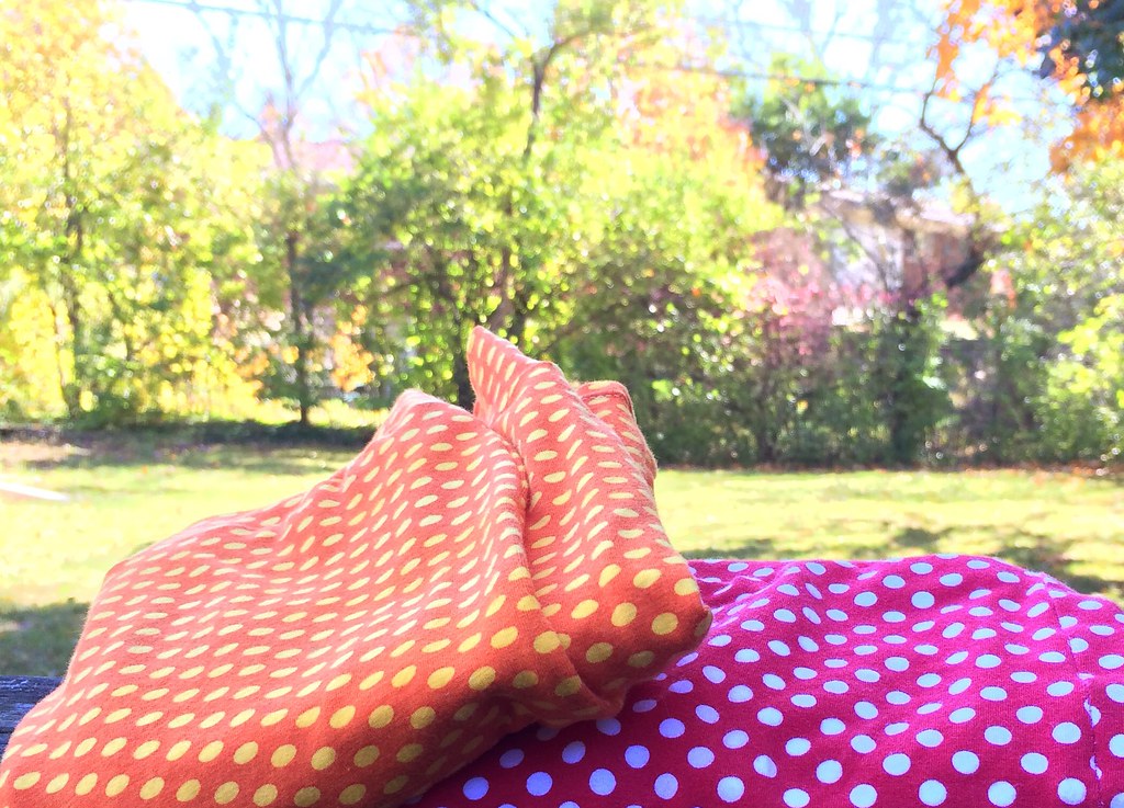
I got these Riley Blake knits from Pink Castle Fabrics. They were fairly close in value, so I over-dyed the orange one with a gold dye to make them look less exactly the same. The dye process also warped (shrunk?) the orange fabric so the round dots became flattened ovals, which was all to the good.

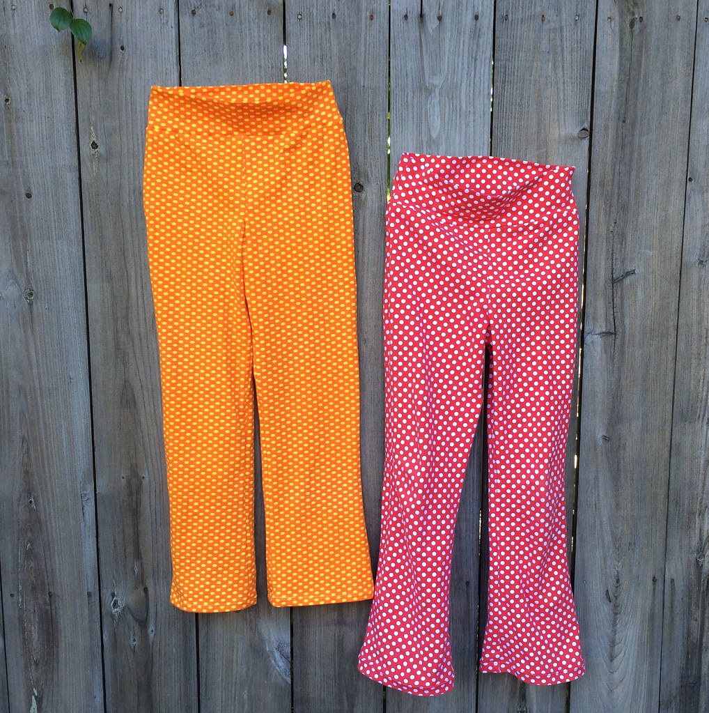
I used McCall's M6985 the only knit pants for girls pattern I could find. I started with the size 8, since they don't list, well, hardly any useful measurements for pants (no rise, no inseam). I used an art gallery knit for my first pair (at $18 a yard! - not the best idea for a muslin) and even after shortening the rise and narrowing the waistband  it was way too large, so I put that away for next year. Then I made a size 7, with an inch and a half removed from the rise, and the waistband width cut practically in half. And that fits her perfectly.


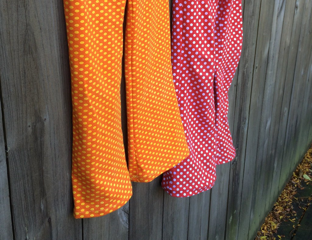
Even without the ruffles on the leg (which, no) the pattern would call for a yard and a half of fabric to cover legs and waistband, but you can do it in one yard, if you're willing to seam the waistband (cut it in two sections, so that you have seams on both the left and right). Which is good, since I was reading the fabric requirements wrong and ordered not enough fabric to do it the way the pattern suggests. (Is it just me, or do I always do that?)


On the second pair, the orange one, I shortened the waistband by another half inch. These, along with a few pairs gleamed from vigilant patrols of children's consignment stores has resulted in enough pants to get us through the winter, but now that I've started looking for knits, I am hard pressed not to buy... I mean, she'll probably need more pants next year? And it would be a shame not to get these owls or these animals, right?

I do feel like I should say, that while I am not super pleased with this pattern, I do think the waistband is put together in a clever way...

Sunday, October 19, 2014

Cleo's garden of motifs

It's funny how an incidental experience can spread its influence, much like the tiny incidents that start a novel splay out into larger events...

We watched the 1963 Cleopatra a few weeks back, and while it isn't the most amazing movie ever made, it is visually amazing, and while I was watching I was sketching. Specifically, I was sketching robots for my illustrator class, but found myself sketching shapes and textures I saw in the background of the film, and from there, designed a ballerina robot. The feathers of the costume are based on either a headdress that Elizabeth Taylor wore, or some sort of plant that was on screen for a few moments, I'm not sure.

This isn't the final version, but you get the idea...
But, that's not all, because I also noticed a flower design. I think it may have been a papyrus flower, but I simplified it dreadfully, and geometrically, and it's the basis of my design for my final project for my color theory class, but I also reconstructed it into a flower for my second illustrator assignment, on symmetry. (this also isn't the final version, but the final version involved something that would confuse my narrative):

The disc shaped flower, that is, not the daisy style one, or the lollipop.
So, I was thinking about this, and how it's not a great design... and so I've been fiddling with motifs to see if I couldn't come up with something more inclined to repeats.

My first attempt was to rearrange the motifs into a diamond, and I added this new shape for a focal point:


Repeating it looks like this:


I decided it was better, but not entirely finished. Then, I thought, well, maybe a blue background?


Which I like even better. And OMG is changing colors a million times easier in Illustrator than in Photoshop!
 
But not being entirely satisfied, I went back to sketching:


And realized one issue with the design is that my disc flower are too long and skinny instead of fat. So, they're newly drafted, with more complex stems. Then I tried more of a scatter approach to laying the motifs out on a four by four grid. But it's not a true scatter because it's a one way design. (And you can see that the star was really two cacti stuck together.)


The tiling is shifted in what is called (at least on Spoonflower) a half drop.

I like it well enough, the flower certainly has improved. I'm not saying I'm done with it, maybe I'll never be done with it(!) but I just wanted to show some process... or progress?

Sunday, October 12, 2014

302

I wasn't sure I'd be posting this week, because it's been rough, but I've done a little research, so I may as well share!

I'm in a color theory class, and for our final project, we are to use Color Aid paper (314 colors) to make a design, that shifts due to the interactions of the colors we use. A grid, with a single design repeated. Sounds like a quilt, right?

So, I'm thinking about this final project, and then I think, wait, why am I making this out of paper, when I could be making this out of fabric?

Then I thought, wait, could I?

Well, my mind turned to Kona cotton, which now has 303 colors, and I set about acquiring charm packs:


I bought the ones that had 41 unique colors, and put them aside. I was not certain that they had no repeats, and thought, well, I'm busy now, but one day, I'll have the time to map it out.

Then I got sick (again!) and stuck in bed, I called up Robert Kaufman's website and made a spreadsheet with all the numbers of each color in the pack, and then compared them to my 2012 color card.


By each color I put a letter denoting the pack it came from, and by each number a checkmark to be sure that all colors were accounted for.

And they were all accounted for! These six charm packs contain all the colors up to the 2012 color card, with no repeats (except one - pfd white). These charm packs are: New Dusty, New Classics, New Brights, New Darks, New Pastel, and New Neutrals.

To get up to 302 you need two more packs: the new 2013 colors, called "Summer 2013" or sometimes just "Summer"; and the new 2014 colors, which isn't widely available yet, though Fat Quarter Shop has it.

From the scant research I've done, I've yet to find a store that carries all of them:

Fat Quarter Shop has 2014, one that's probably 2013 (but doesn't give us the item number to compare), Dusty, Pastel, and Classics.

Fabric Shack has Bright, Classics, Neutrals, Dark, and Pastel. (The one called new colors is the new colors for 2012, which are included in the other packs)

Hawthorne Threads has Bright, Dark, Dusty, Neutrals, Pastel, and Summer 13.

I'm still waiting on getting 2013 and 2014, because clearly I should have done the research before I bought the fabric!

And I'm still deciding what to do with these. I'm thinking maybe a tiny courthouse steps block?

Sunday, October 5, 2014

Road Trip Case, number 3.

And I have plans to make more of these! Also mostly with Tula Pink fabric...


When I made my first Road Trip Case, it was unremarked upon in my house. When I was looking through examples of ones other people made online, my younger child demanded one, and as I was looking for another project to feature Heather Bailey's Up Parasol (the first being this pillow), I obliged. But making a thing for one child requires making a thing for the other one, right?


What was requested was red and purple. I couldn't manage that in my head, so I just used red as the jumping off point. I started this in August, and managed to get the outside quilted. I cut out a lot of pieces, but tossed many of them out when I found the yellow trees on Etsy a few weeks back, and of course Tula Pink's new collection Moon Shine was released in September, and I needed that red camping print. So, some of the pieces from the first version stayed, and maybe the chessboard doesn't make as much sense as it would have with the first fabric choice of the main inside bit...


Initially the whole background was going to be this black and red checkerboard, which now is only the inside of the flaps.
And then I lost the binding I'd cut, and my child chose the new one (Jenean Morrison's Sunday Paper from In My Room), which while looking great with the outside maybe doesn't sit right with the checkerboard either, but well, it's done. And after six weeks - seven? - maybe that's enough.

The Road Trip Case pattern is by Anna Graham of Noodlehead. My only notes on the pattern is that I cut my bias binding 2 3/4" wide - and sew it to the inside to keep from having to handstitch the other side to the vinyl, and I cut my vinyl 1" wider and longer on all sides, and trim it back once it's basted in place, since it's hard to line up the zipper.