-->

Sunday, December 28, 2014

Fugitive Flower Quilt, on the outset

I promised you a look at my final project for my Color Theory Class, and here it is:


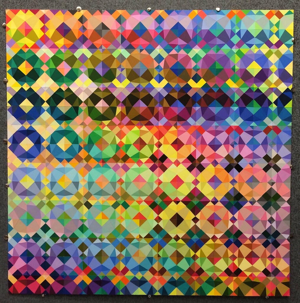
I call it, the Fugitive Flower, because... well, each block is a flower, but joined together in groups the larger secondary designs take over.

It's 30" square and cut from paper (and paint chips for when I couldn't find suitable paper) it's at least 320 colors, though it may be more. The assignment was to use a single design on a 2" square, and then, by repeating the design using different colors, changing the emphasis (so, 225 individual squares). Many people managed this with much less ambitious projects. Mine was, I think, the second most ambitious in the class, and I estimate it took around 60 hours? I initially expected it would take 100 hours, but I managed to save some time when I stopped working on it block by block, and started to fill in swaths of either foreground or background:

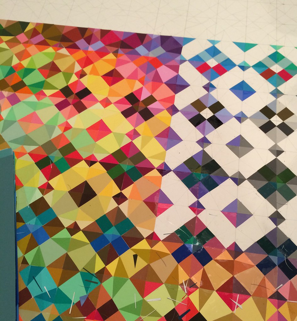
filling in the background approaching 150 squares.
And it shows the shreds of paper, where each piece had to be fitted individually.

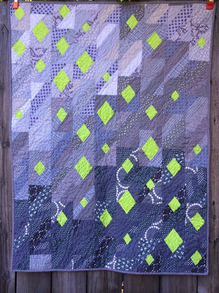
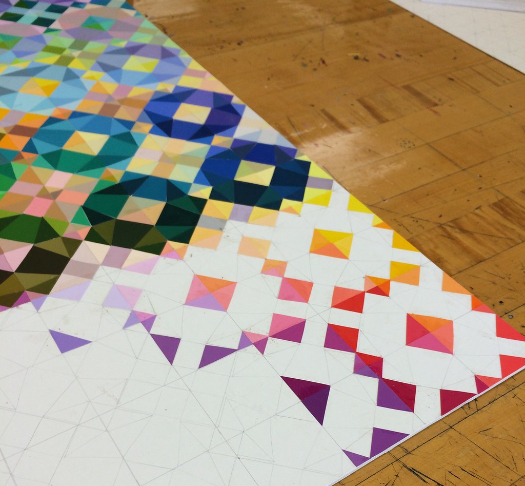
This next one is similar, but one of my favorite pictures of it, also taken at school in daylight, so that's a plus. Most of the pictures I took of it were Midnight in the Basement pictures.


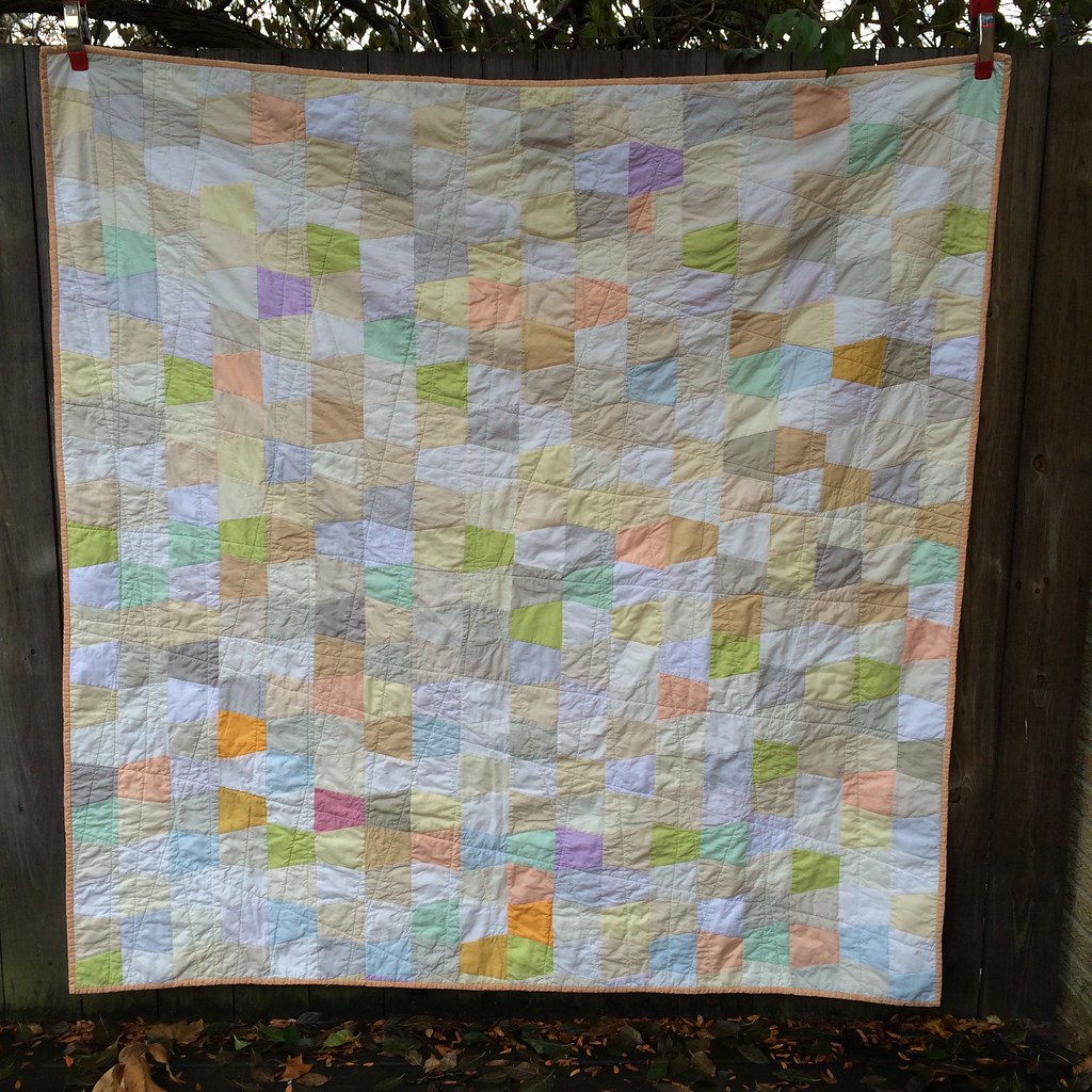
Anyway, as I'd been posting it to Instagram, everyone kept asking if (or when?) there would be a quilt, so, here you are, here's an answer: Yes, there will be.

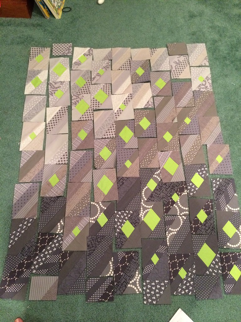
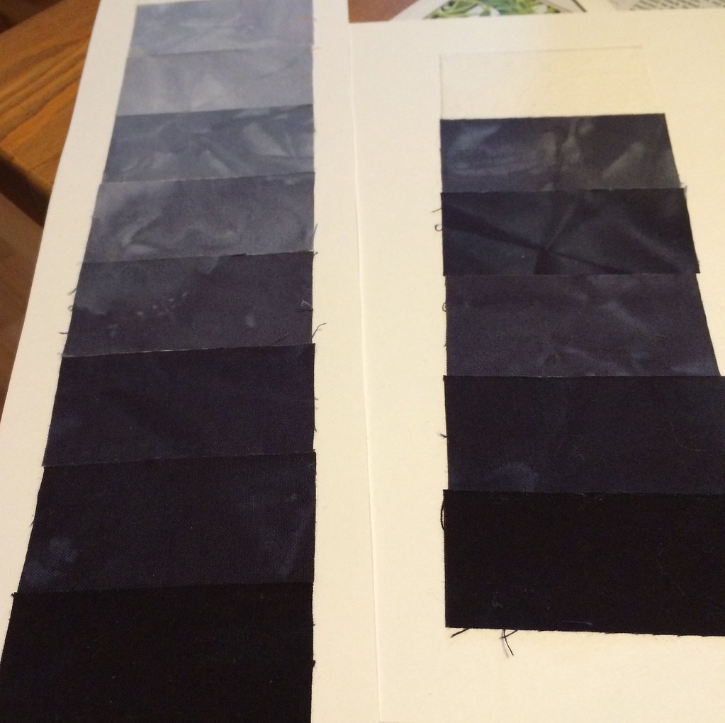
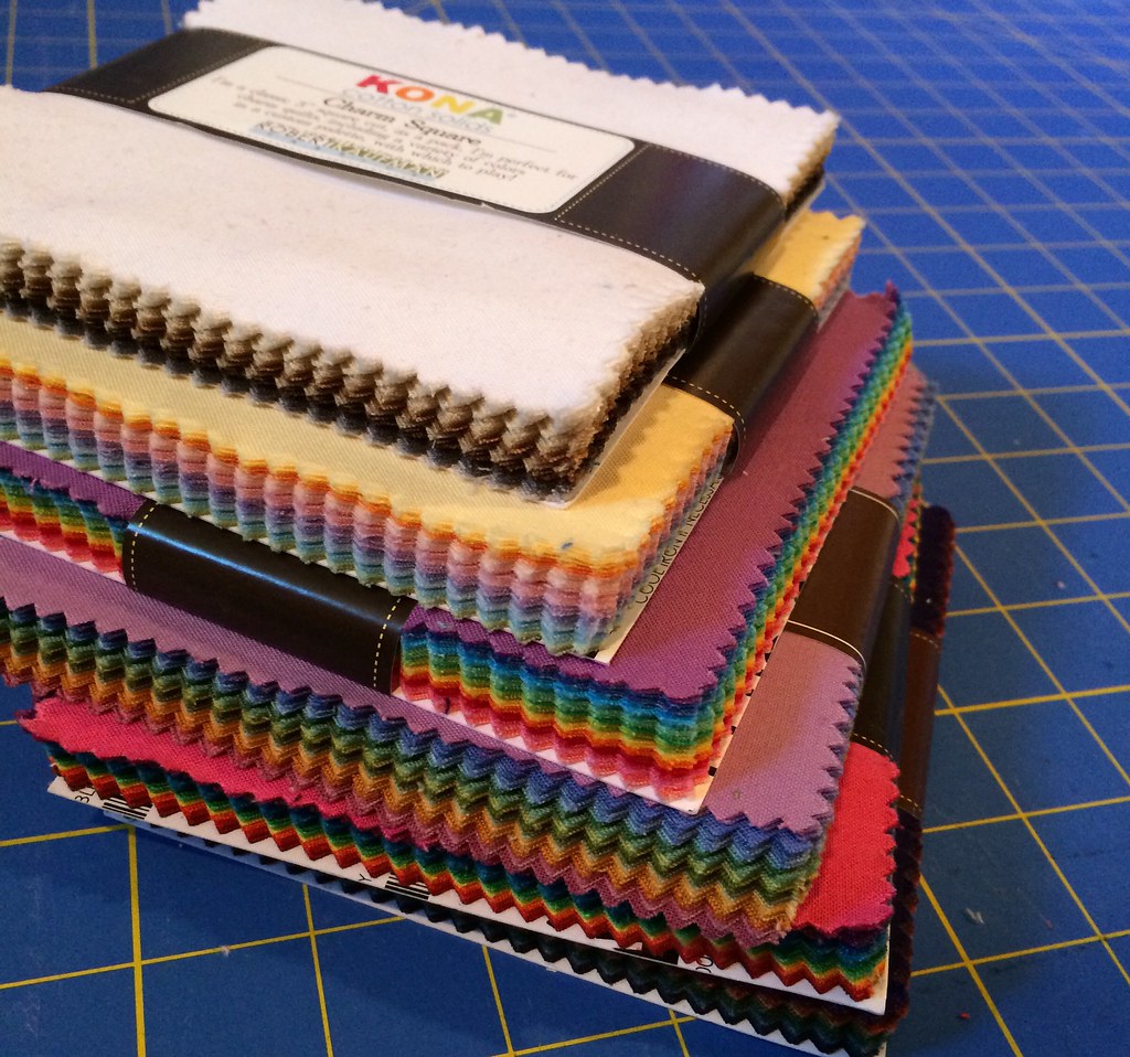
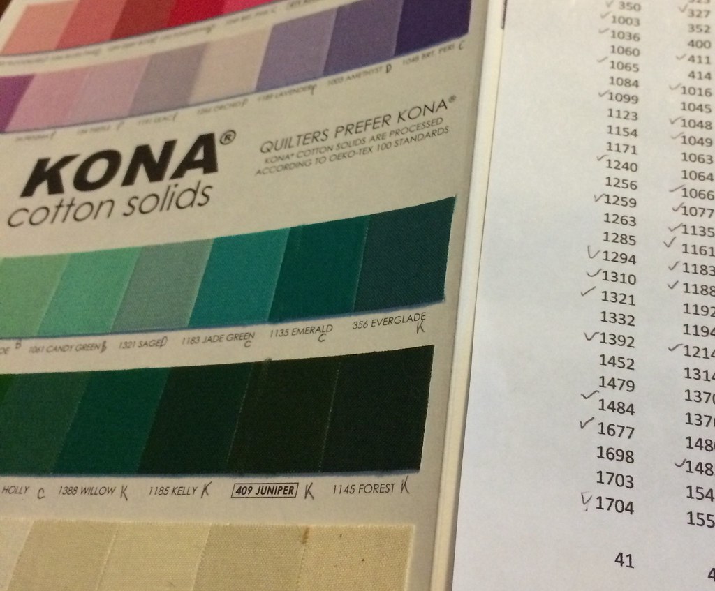
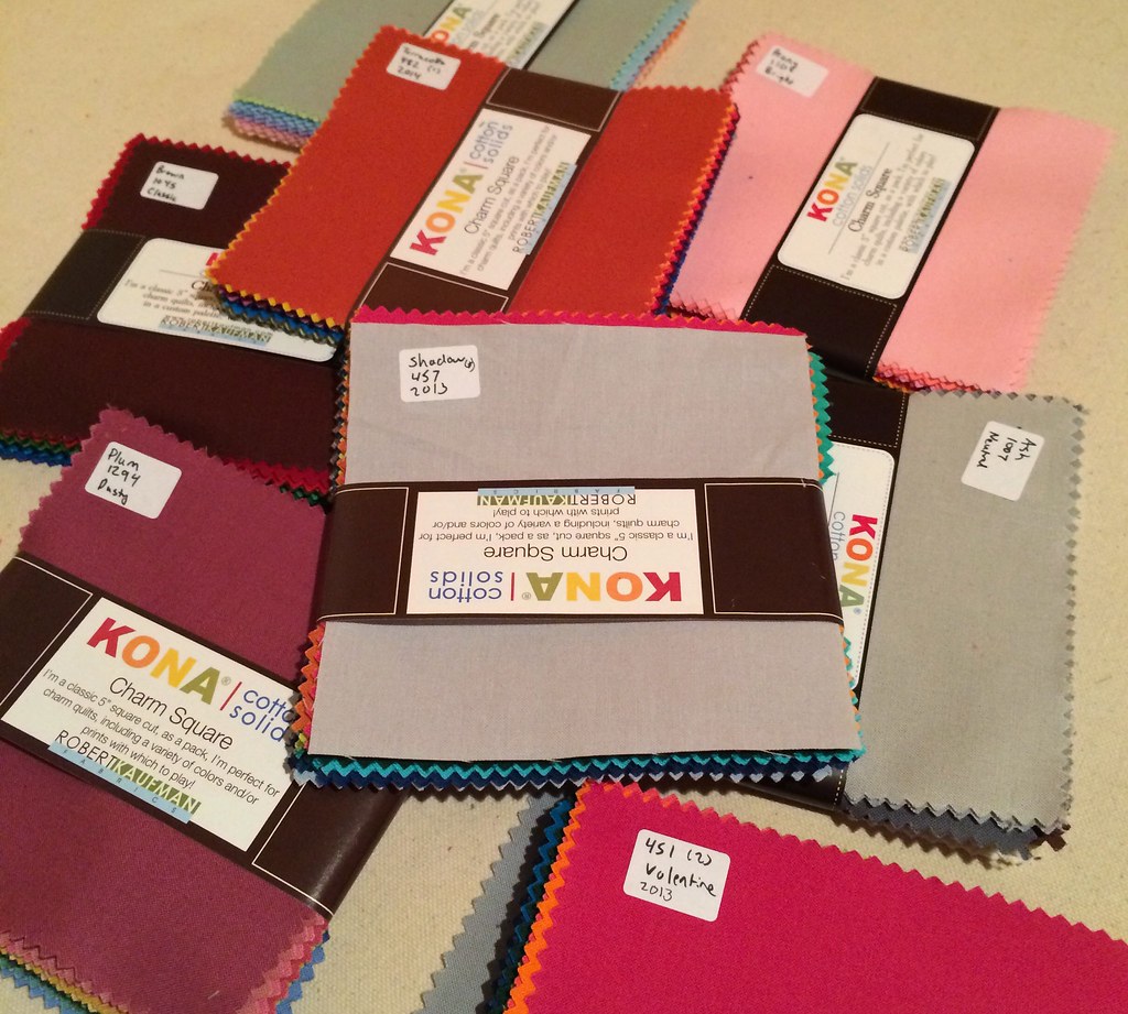
I'm working on a Kona 303 quilt (luckily I had some PFD white stashed), and I spent Christmas break labeling the 302 charm squares I'd purchased (actually, with duplicates, there's more than 302...) Then sorting them by color.


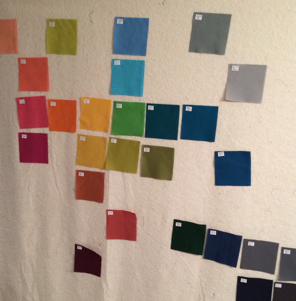
And starting to pick out the background:


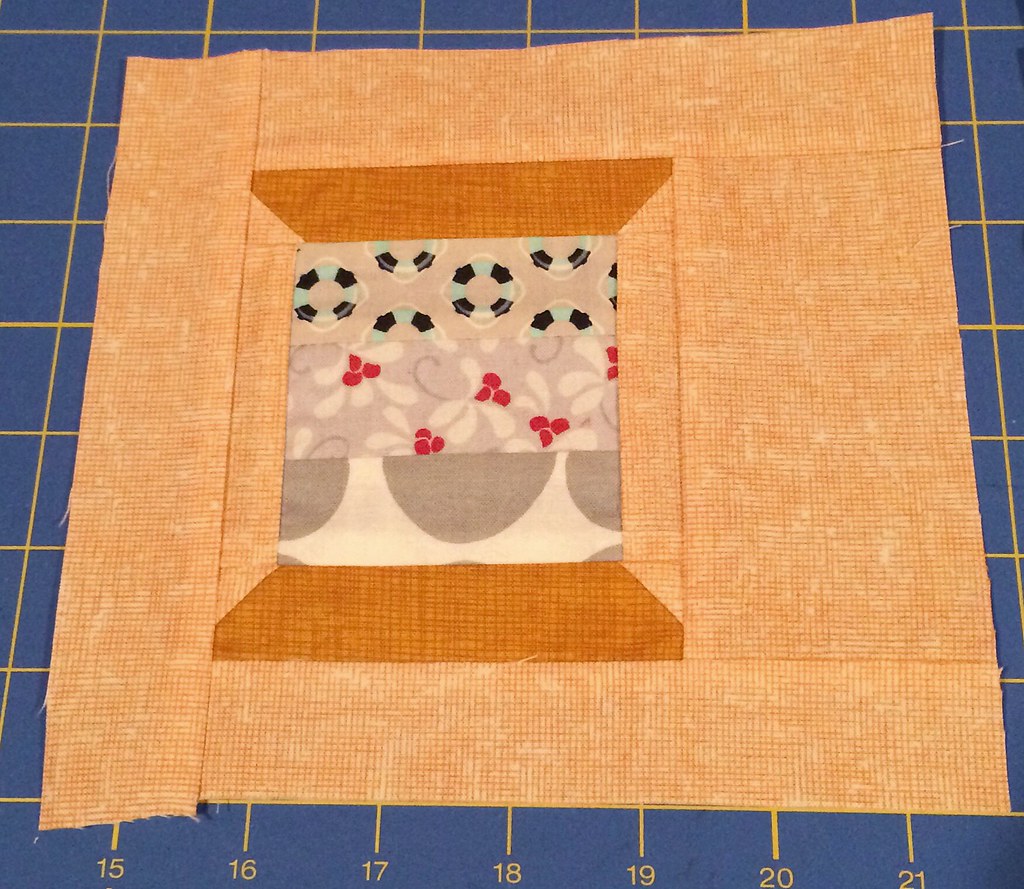
And making paper pieced templates to use to make the blocks:


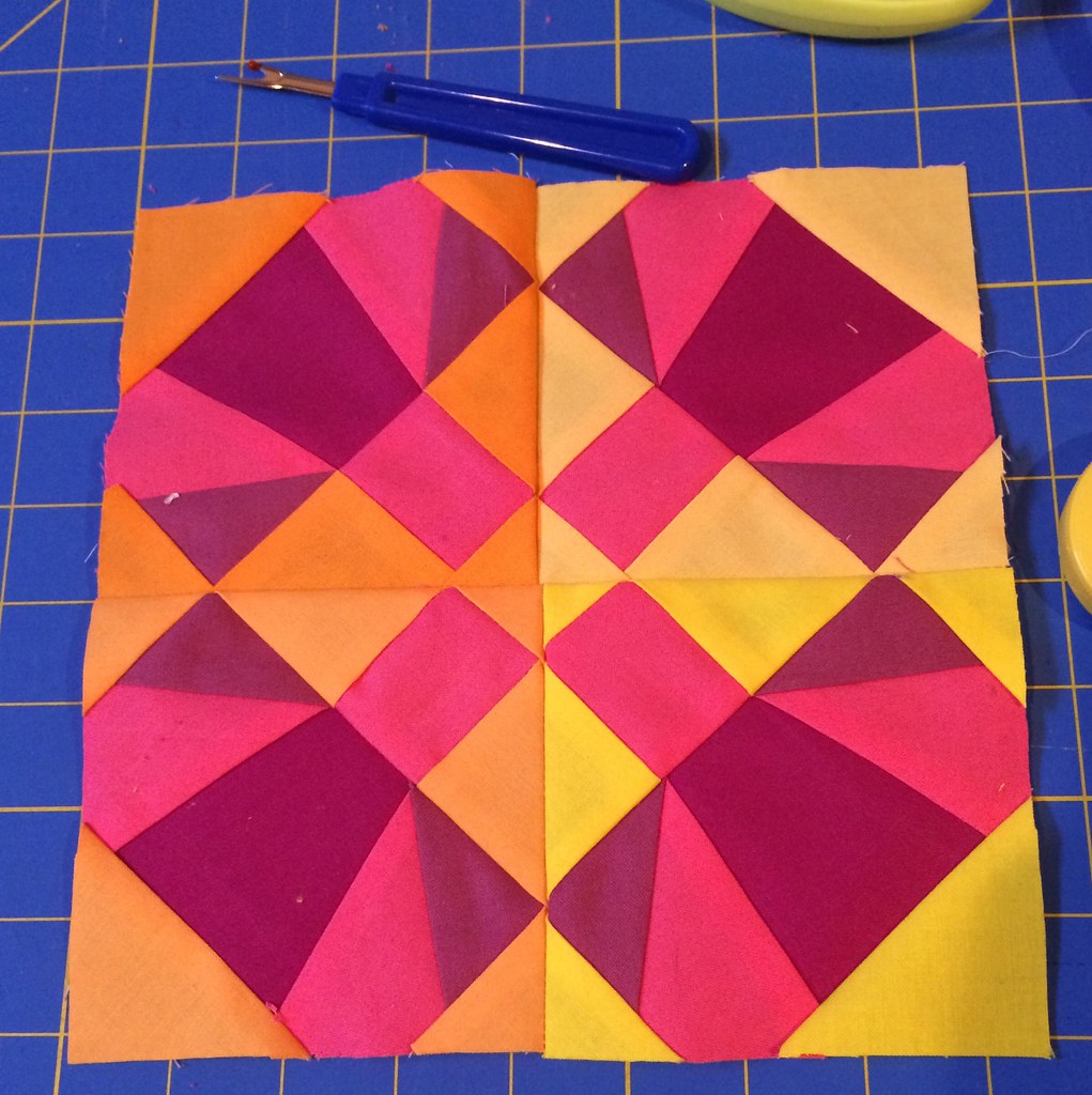
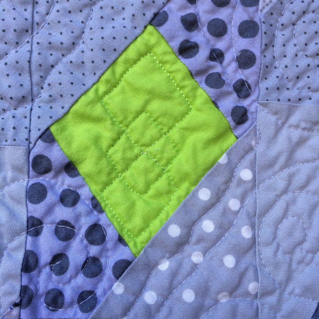
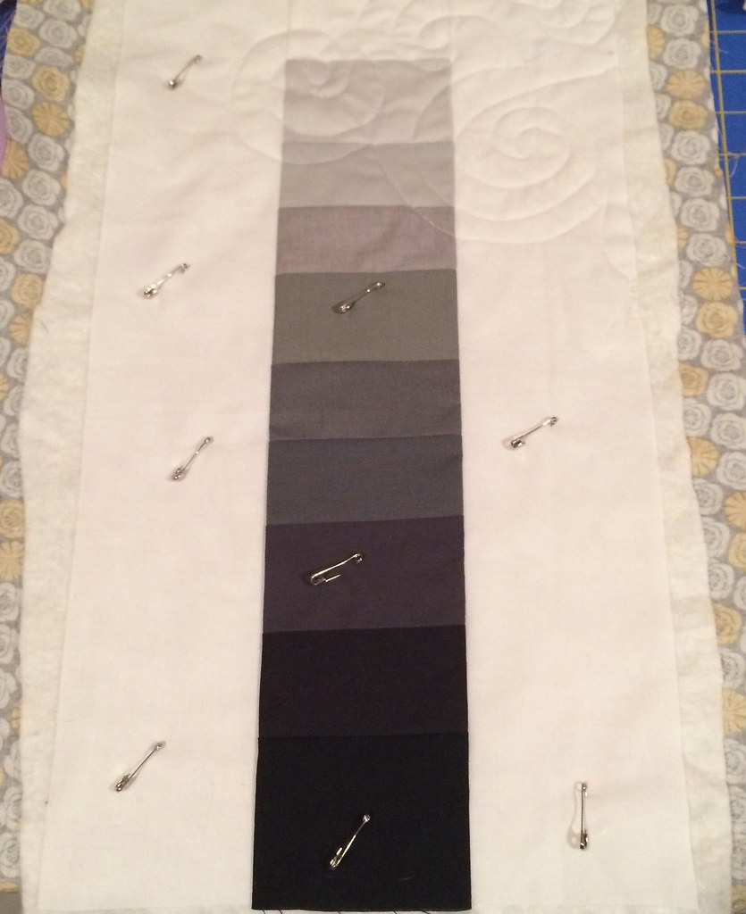
This one was a test, to be sure that they could be done with charm squares, and there is easily enough fabric for the 4" size, except in the background where there is only just enough fabric, well, there's a little wiggle room, you can mess up one corner, but one only, just as long it's not one of the larger ones.

I have picked out petal colors, but pairing them to the background and choosing stem fabrics is something I am going to put off until all the petals are complete, because I want to work with the fabric in my hands, rather than using color cards.

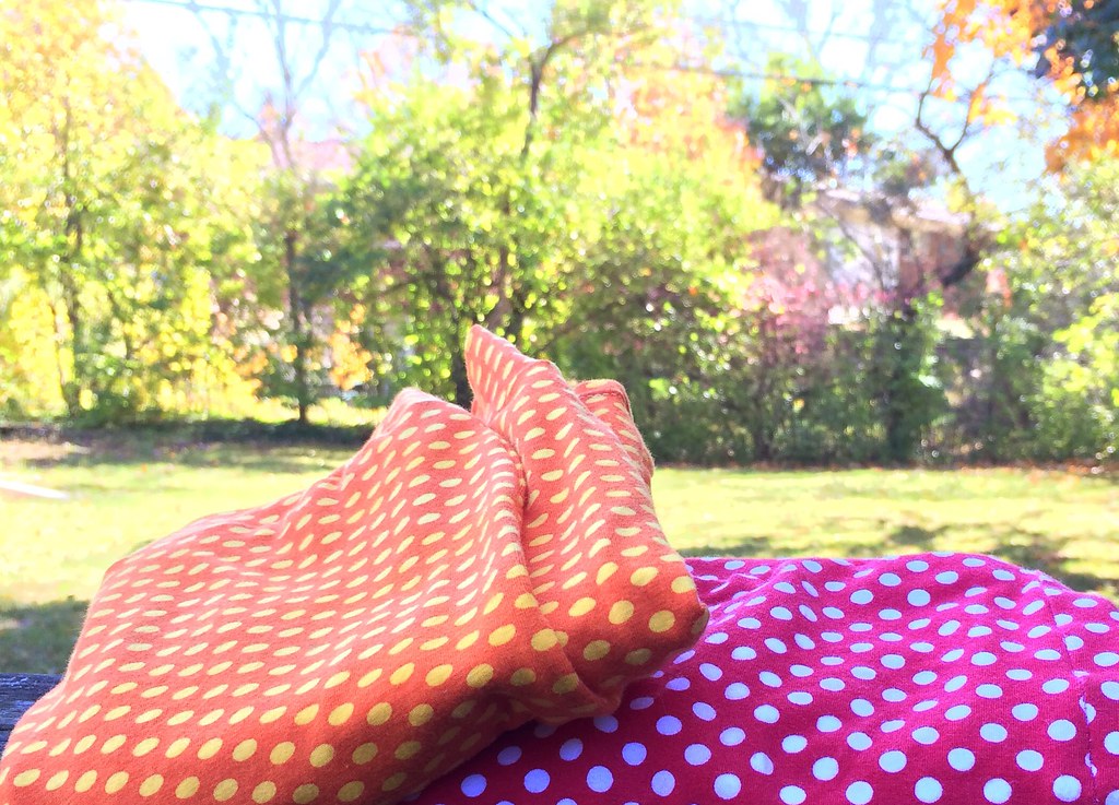
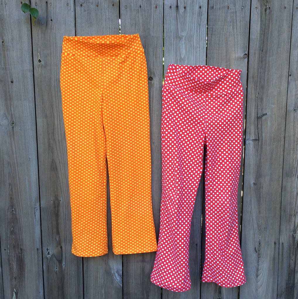
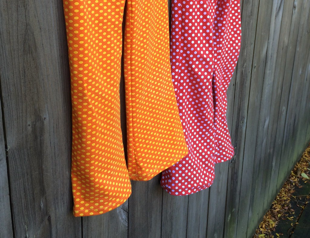
So, I'm all set to go! Though there are a few things I should take care of first, like getting my two quiltcon quilts out the door.

And there will be a pattern! I just need to finish selecting the colors, which clearly I'll be doing on the fly. So, it may be a few months... but hopefully worth the wait?

Sunday, December 21, 2014

Many Days of Organization

My school semester was over on Monday, I had two projects due and an exam. Afterwards I came home to my sewing room and just walked away again, because the place was a mess!

I'd bought a few things, and taken out many fabrics off my shelves and left everything in piles on all the surfaces, although my friend pointed out that at least the floor was clear... small victories....

On Tuesday night, I started in to actually sort and put things away. And on Wednesday I began the long process of wrapping fabrics on comic book boards, and by Thursday finally began to reorganize my drawer unit of small cuts so that all the solids could be together.

And on Friday, I had enough room to cut on the cutting board and iron on the ironing board, so I made some pillows, which is the easiest thing, but satisfying, especially after weeks of not having time to sew:


They are this fantastic Rashida Coleman-Hale print on the front and plain old Essex Linen on the back.

Other organizing has been labeling my Kona charm packs:


Currently, I have three packs out of eight done, but it's easy enough sitting in front of the tv work.

And I also made a color card from my RJR cotton supreme fabrics using glue (mod podge) and bristol paper, and the handy labels that Pink Castle provides on their solid cuts:


This is about five or six Color Inspirations bundles worth of colors, plus a few colors I got yardage of (Battleship, guys, so good), so I guess I have a long way to go still! I haven't been in the club, but have been picking up the odd spare bundle from the shop, but I am planning to join in the new year and getting all the bundles! Next year's line up looks very exciting.

Sunday, November 30, 2014

Some sewing!

We had a "holiday week" and it's fall break for the community college, which my art teacher seemed to think meant we would get lots done on our final projects.

Well, for me, it meant I got in a few full days of work! And then we traveled to Ohio for Thanksgiving this year, so there wasn't much time to work on my project...

But traveling means handsewing, so I finished my English Paper Pieced pincushion:


This one is the size of an orange, rather than the first one that was grapefruit sized. I used this tutorial to make it, with some favorite scraps from my scrap bins. (Remember! 5/8" inch sides, and if you email me, I have a pdf of the templates I can send you). Once again I didn't have enough polyfil, but luckily my relatives had a bag of polyfil on hand, so I could supplement.

Yesterday I took a break from my endless final project for my art class (which you can see if you follow me on instagram, I'm sure I will post it one day here as well!) and tried my hand at the pattern I've chosen to make for my partner in the Schnitzel and Boo Mini Quilt Swap. It's Mini Spools by Camille Roskelley/ Thimble Blossoms.


The pieces here are pretty tiny, and I had a few moments of doubt, but it turned out pretty cute. I still have to decide on a background and a spool fabric for the swap, but I'm pretty well decided on my fabrics for the "thread" part.

I used some scraps from my grey scrap bin for the "thread" here. I was thinking that I could use the block next time we had a guild mug rug swap, but maybe the Salt Water with Christmas fabric is a bit too odd?

But at least I know my sewing machine works, after two weeks at the shop.

Sunday, November 23, 2014

Fresh Water Pearls

I'm not much of a person for jewelry, but I do like the look of fresh water pearls... The more odd and imperfect in shape, the better.


This started off as a study in white, cream, and grey, inspired by Yoshiko Jinzenji's Quilting Line and Color (which I totally regret buying, now that it's fifty dollars a copy!), where she talks about shades of white, and it wasn't something I had ever thought of before, but it's there if you look!

So, the Easter before last I bought all the pale neutral colors of sketch and Carolyn Friedlander's crosshatch (actually, I bought all the colors, or at least most, but I only used the light ones. And as a side note, I am so excited they are making more!) And lots and lots of solids, in shades like parchment, ash, bone, and several just called white. And some I didn't use because they were too dark. And my favorite Pearl Bracelet - sandbox.  There is also a white on white bird print in there somewhere.


I cut out the tumblers with a sizzix die. On the Halloween before the last! And then I started to sew them together. Then I realized I didn't have enough, and cut another round. I finished the top at the end of May, at Camp Stitchalot, then got it basted in June, if the label can be believed. And then it sat! Until a few weeks ago when I panicked and took the day off to get the quilting done, and then a few nights to get it bound. And washed. I needed it washed before the picture, because I used a washable graphite pencil to mark the lines, and I wasn't positive it would come out, but it did, so whew!

I meant to free motion it, but time was an issue! I want to enter this one for quiltcon and the deadline is next week!

The brighter colors, the yellows, pinks, and purples came in at the last moment, because I grew tired of all that pale stuff. I think they give it a nice surprise.


Thursday, November 20, 2014

Where I shop for fabric

I've been thinking about this since I got my partner assigned for the Schnitzel and Boo Mini Quilt Swap. Her likes and mine over lap a little, so I've been doing a little shopping to get a few more prints from her favorite designers so I can make a mini quilt she is more apt to love. (But! that said, you need to be careful not to buy something you hate, because for a mini quilt, chances are you're not going to be using much of it. You need to look to where your taste and your partner's taste overlap.)

So, when I am looking for fabric, here's where I go:

1. Pink Castle Fabrics. I am super lucky that this is my local quilt shop, but most of their business is online, so you can get anything I can get! And even though I can technically go to the store, it is easiest for me to buy online and swing by quickly to pick up. If you sign up for the newsletter you'll be first to know about new arrivals and sales! They specialize in modern, Japanese, and solids, and also carry many fine apparel fabrics.

2. Fabric Shack. My favorite shop for more mainstream quilt fabrics. They don't always have the newest trendy line, but they don't have the turnover that many online shops do, (I suspect because they buy more fabric than other shops), so you can sometimes score something from a few years back. And they put things on sale all the time.... If I'm looking for basics and blenders (dots, stripes, etc) and large amounts of fabric for quilt backs for the least amount of money, this is where I go. Plus, apart from great prices, they discount shipping, and they're one of the few fabric shops that will cut quarter yards. Great for getting a large range on a budget. And they are super fast with getting orders out the door. And if you have a chance to go to their store, do! It's seriously amazingly huge.

3. Hawthorne Threads. Another great modern online shop! If they don't have it, it isn't cool. Also they have a large selection of knits, which is important to me now, I guess.

4. Etsy. Little shops sometimes hold on to things that are sold out in big shops.

5. Fabric dot com. It's hard to beat free shipping. I have heard horror stories about poorly cut fabric, but I personally haven't had an issue, though I only go with them when I can't find something elsewhere. I prefer to go with the littler shops, who love fabric as much as I do.

About shopping online. Color is an issue, and scale, it's hard to know what you're getting, so you need to be prepared for a surprise. I have firm opinions about what I like in a quilting cotton, hand-wise, so when I shop online I stick to brands that I know and trust that their substrate is one I approve of.

What shops do you like?

Sunday, November 16, 2014

Baby quilt with diamonds


I don't really have a name for this quilt. Or I have several. I made this for a friend who had a baby recently. She requested grey and lime.


I chose grey fabrics that seemed neither too warm or too cool, just grey, and for the most part only solids or white, grey or black prints (though there are two exceptions, at least). I paper pieced each block, dividing the blocks (and the fabric) into light, medium, and dark. Once they were rectangled up, I lay them out and moved them around until I liked them.

This color looks more true to me than the outside picture.
I pieced it together, but ran into trouble with the half blocks, they were too big! so it's a bit skewed from what it was supposed to be.


I quilted it with wavy lines and swirls, with a sort of argyle pattern in the larger diamonds.


And here's the back, one of my favorites, Modern Metro in apple (I believe...?)

I'm thinking about writing up the pattern, but I also kind of don't want to see it again. We'll see. When I begin to sew again.

Sunday, November 9, 2014

Grayscale

My Color Theory class has spent the last two weeks on value, starting with gray scale exercises and moving into color. One of these gray scale exercises was to find, through mixing paint, what appears to be by eye ten even steps between white and black.

I don't paint. And I while I do dye, there is such a difference in value between wet dye and dry I figure it would be hard to judge what you had until after it's dry.

I did it in fabric, using solids I had in my stash. I even opened two of my Kona charm packs to get a few options, though I only used two of the charms in the end. (Actually, I laid it out with prints first, then prints and solids, then I realized I had enough solids to do the whole thing.) The hard thing with grey is hitting that middle hue, which is neither too warm or too cool...


It's got kind of a dreamy focus on, because my lens wasn't clean, but it's too cold to reshoot!

Let's see if I can reconstruct it. I think the top white is Windham's Optical White, the next is RJR's cotton supreme Argento, the next is one of the Kona 2013 colors -Shadow, the next is a Peppered Cotton, Kona Pewter, not sure on the next one, then Kona Steel, not sure on the next - it may have been a hand-dyed fabric, then Moda Bella Washed Black, and Windham Black.

I used the supposed Optical White on the sides, and started quilting with my default all over swirls, but then my machine died, and I had to finish it with my straightline only machine. I bound it with a white on white dot, because I had it left over from last year's tree skirt (oddly I also used the same backing fabric as the tree skirt, though the connection did not occur to me until a day later.)

Linking to Sew Solid Sunday!

In other news, Spoonflower is having a 2/1 fat quarter sale for another day or two, so feel free to buy from my shop!


Sunday, November 2, 2014

A week

I was going to pass this week by, since I don't have any finishes, but I've done a lot of stuff, and I may as well share, though most of this you've seen if you follow me on Instagram.

I got buttons for the QuiltCon button exchange (yes! I'm also going to QuiltCon!):


Hayley of Hayley Sews did mine, and I recommend her highly. My husband pointed out that I'm not super associated with this bird, except maybe in my head? It's on my quilt labels. And also, huh, well, I thought it was on my Etsy header, but it's not. Uh. Well, it's my bird, anyway, even if I'm not getting it out there. Oh, here, it's my Spoonflower logo.

I made this collage from magazine pages. I'd like to use it as a color scheme for something... no idea what yet.

I made a lot of progress on this English paper pieced pincushion:


I think it's funny that the collage and the pincushion share several colors. Also, if you want to make one and can't get her templates to download I have a pdf I can send you - blotchandthrum (at) gmail (dot) com.

I made a grayscale mini quilt for my color theory class, using white, grey, and black fabrics I had on hand:


And then I had to stop quilting it cause I broke my sewing machine! (cries) I think I chipped the bobbin case. It may be the shop for like two weeks, because if that's the case, they have to order the piece. I still have my straight line quilter, so I may still finish this. Currently, the plan is to take it in as is for a critique tomorrow.

And I worked on another assignment about value for color theory involving dye:

This was last night.


And here it is today, glued on paper. I would sure prefer to quilt it, but it takes too much time, and also, did I mention my sewing machine is in the shop?

So, that was a pretty exciting week after all!

Sunday, October 26, 2014

On pants

My older child has the tendency to want things just so. Just as they have always been. Not being one to embrace change in any way, we've had some issues with her wardrobe - the size 5 sweatshirt she's been trying to wear up until last fall comes to mind... the socks that are worn through at the heels because she has turned her nose up at every proffered replacement.

At any rate, she's well into elementary school, and all the stores are full of jeans. We've never pushed jeans, because on little kids, they're kind of silly. So, she's been wearing knit pants, mainly from Gymboree, which are bright, in fantastic patterns, and I guess they stopped selling them a few years ago.

Right now, it seems the stores are full of jeans and leggings, and you can't find pants to save your life. But you can't tell that to my kid, because she wears pants. So, well, faced between my kid's stubborn streak and the desert of the mall, where else does one go but the fabric store?


I got these Riley Blake knits from Pink Castle Fabrics. They were fairly close in value, so I over-dyed the orange one with a gold dye to make them look less exactly the same. The dye process also warped (shrunk?) the orange fabric so the round dots became flattened ovals, which was all to the good.

I used McCall's M6985 the only knit pants for girls pattern I could find. I started with the size 8, since they don't list, well, hardly any useful measurements for pants (no rise, no inseam). I used an art gallery knit for my first pair (at $18 a yard! - not the best idea for a muslin) and even after shortening the rise and narrowing the waistband  it was way too large, so I put that away for next year. Then I made a size 7, with an inch and a half removed from the rise, and the waistband width cut practically in half. And that fits her perfectly.


Even without the ruffles on the leg (which, no) the pattern would call for a yard and a half of fabric to cover legs and waistband, but you can do it in one yard, if you're willing to seam the waistband (cut it in two sections, so that you have seams on both the left and right). Which is good, since I was reading the fabric requirements wrong and ordered not enough fabric to do it the way the pattern suggests. (Is it just me, or do I always do that?)


On the second pair, the orange one, I shortened the waistband by another half inch. These, along with a few pairs gleamed from vigilant patrols of children's consignment stores has resulted in enough pants to get us through the winter, but now that I've started looking for knits, I am hard pressed not to buy... I mean, she'll probably need more pants next year? And it would be a shame not to get these owls or these animals, right?

I do feel like I should say, that while I am not super pleased with this pattern, I do think the waistband is put together in a clever way...

Sunday, October 19, 2014

Cleo's garden of motifs

It's funny how an incidental experience can spread its influence, much like the tiny incidents that start a novel splay out into larger events...

We watched the 1963 Cleopatra a few weeks back, and while it isn't the most amazing movie ever made, it is visually amazing, and while I was watching I was sketching. Specifically, I was sketching robots for my illustrator class, but found myself sketching shapes and textures I saw in the background of the film, and from there, designed a ballerina robot. The feathers of the costume are based on either a headdress that Elizabeth Taylor wore, or some sort of plant that was on screen for a few moments, I'm not sure.

This isn't the final version, but you get the idea...
But, that's not all, because I also noticed a flower design. I think it may have been a papyrus flower, but I simplified it dreadfully, and geometrically, and it's the basis of my design for my final project for my color theory class, but I also reconstructed it into a flower for my second illustrator assignment, on symmetry. (this also isn't the final version, but the final version involved something that would confuse my narrative):

The disc shaped flower, that is, not the daisy style one, or the lollipop.
So, I was thinking about this, and how it's not a great design... and so I've been fiddling with motifs to see if I couldn't come up with something more inclined to repeats.

My first attempt was to rearrange the motifs into a diamond, and I added this new shape for a focal point:


Repeating it looks like this:


I decided it was better, but not entirely finished. Then, I thought, well, maybe a blue background?


Which I like even better. And OMG is changing colors a million times easier in Illustrator than in Photoshop!
 
But not being entirely satisfied, I went back to sketching:


And realized one issue with the design is that my disc flower are too long and skinny instead of fat. So, they're newly drafted, with more complex stems. Then I tried more of a scatter approach to laying the motifs out on a four by four grid. But it's not a true scatter because it's a one way design. (And you can see that the star was really two cacti stuck together.)


The tiling is shifted in what is called (at least on Spoonflower) a half drop.

I like it well enough, the flower certainly has improved. I'm not saying I'm done with it, maybe I'll never be done with it(!) but I just wanted to show some process... or progress?

Sunday, October 12, 2014

302

I wasn't sure I'd be posting this week, because it's been rough, but I've done a little research, so I may as well share!

I'm in a color theory class, and for our final project, we are to use Color Aid paper (314 colors) to make a design, that shifts due to the interactions of the colors we use. A grid, with a single design repeated. Sounds like a quilt, right?

So, I'm thinking about this final project, and then I think, wait, why am I making this out of paper, when I could be making this out of fabric?

Then I thought, wait, could I?

Well, my mind turned to Kona cotton, which now has 303 colors, and I set about acquiring charm packs:


I bought the ones that had 41 unique colors, and put them aside. I was not certain that they had no repeats, and thought, well, I'm busy now, but one day, I'll have the time to map it out.

Then I got sick (again!) and stuck in bed, I called up Robert Kaufman's website and made a spreadsheet with all the numbers of each color in the pack, and then compared them to my 2012 color card.


By each color I put a letter denoting the pack it came from, and by each number a checkmark to be sure that all colors were accounted for.

And they were all accounted for! These six charm packs contain all the colors up to the 2012 color card, with no repeats (except one - pfd white). These charm packs are: New Dusty, New Classics, New Brights, New Darks, New Pastel, and New Neutrals.

To get up to 302 you need two more packs: the new 2013 colors, called "Summer 2013" or sometimes just "Summer"; and the new 2014 colors, which isn't widely available yet, though Fat Quarter Shop has it.

From the scant research I've done, I've yet to find a store that carries all of them:

Fat Quarter Shop has 2014, one that's probably 2013 (but doesn't give us the item number to compare), Dusty, Pastel, and Classics.

Fabric Shack has Bright, Classics, Neutrals, Dark, and Pastel. (The one called new colors is the new colors for 2012, which are included in the other packs)

Hawthorne Threads has Bright, Dark, Dusty, Neutrals, Pastel, and Summer 13.

I'm still waiting on getting 2013 and 2014, because clearly I should have done the research before I bought the fabric!

And I'm still deciding what to do with these. I'm thinking maybe a tiny courthouse steps block?

Sunday, October 5, 2014

Road Trip Case, number 3.

And I have plans to make more of these! Also mostly with Tula Pink fabric...


When I made my first Road Trip Case, it was unremarked upon in my house. When I was looking through examples of ones other people made online, my younger child demanded one, and as I was looking for another project to feature Heather Bailey's Up Parasol (the first being this pillow), I obliged. But making a thing for one child requires making a thing for the other one, right?


What was requested was red and purple. I couldn't manage that in my head, so I just used red as the jumping off point. I started this in August, and managed to get the outside quilted. I cut out a lot of pieces, but tossed many of them out when I found the yellow trees on Etsy a few weeks back, and of course Tula Pink's new collection Moon Shine was released in September, and I needed that red camping print. So, some of the pieces from the first version stayed, and maybe the chessboard doesn't make as much sense as it would have with the first fabric choice of the main inside bit...


Initially the whole background was going to be this black and red checkerboard, which now is only the inside of the flaps.
And then I lost the binding I'd cut, and my child chose the new one (Jenean Morrison's Sunday Paper from In My Room), which while looking great with the outside maybe doesn't sit right with the checkerboard either, but well, it's done. And after six weeks - seven? - maybe that's enough.

The Road Trip Case pattern is by Anna Graham of Noodlehead. My only notes on the pattern is that I cut my bias binding 2 3/4" wide - and sew it to the inside to keep from having to handstitch the other side to the vinyl, and I cut my vinyl 1" wider and longer on all sides, and trim it back once it's basted in place, since it's hard to line up the zipper.

Wednesday, September 24, 2014

The Last Good Weekend


I was on vacation when the last free swatch offer on Spoonflower went up, so without access to a computer, I had to just pick something I knew I hadn't printed, so I picked my entry to the Noir contest - The Last Good Weekend.

The bird is just a watermark.
I posted this before, and here that is. The funny thing is that I say right there not to order it because it has a fake pattern repeat. And yet I completely forgot that 10 months later. Wouldn't you know?

Anyway. The other funny thing is that when I got my swatch of it in the mail, my four year old was all, Mommy, make me a bag from this! 

Yeah...no. I don't know what people think of me now, but I think if my kid is carrying around a bag with shot glasses on it, we all know what they'll be thinking then!

I took the swatch to the Ann Arbor Modern Quilt Guild meeting, and it was a hit, so I'm writing this post primarily to provide the direct link to the fabric for interested friends.

I then realized there was a flaw - it was designed as a fat quarter, and the original design only extended 36" x 25". The repeat isn't mechanical, I placed each motif manually! I've managed to copy and paste more motifs into it till it's 44" x 36" so if you order a yard, you'll now have a full yard without issue, but if you order multiple yards, there's going to be a place where designs don't line up at the boundary between the first yard and the second (and so forth).

Another warning! The swatch I showed, the Eco Canvas, is at least in part polyester. The dyes they use are bright on polyester, but tend to be duller on a woven cotton. So the color may be slightly different from the swatch as well. 


Tuesday, September 23, 2014

On leaving things out

So, when I posted Dragon Park on Sunday, I was in despair. And also sick with a head cold. Maybe they were related? No matter!

I went to art class on Monday, and during the critique of homework assignments, I had a revelation.

It's not about reality. It's about the piece.

What happened was this - someone had made a full color picture of their pet for the assignment, an animal which has black and white spots. I said something to the effect of, "because you used white, those are the brightest thing in the picture, and you should consider yellowing them to cream in order that they become less distracting." And another person in the class was like, "but if the creature is black and white, you should use black and white..."

But, no. You shouldn't. Because art is not reality. It's a shorthand form of reality. (Also! there are a billion shades of white, and you quilters know this already, am I right?)

And in an image the lightest thing (or the darkest, or the most saturated, or whatever it is) in the picture is going to be the center of attention, so you need to choose it carefully. And! Also, back to my own problems with my piece, you can't just cram shit in because you spent days drawing it and it's part of the story in your head that compelled you to start the silly thing in the first place.

It's not about reality. It's about the piece.

I have another illustration of the point, from a 3D class I took nearly a decade ago. We had a project where we had to make a clay model combining two unrelated objects that shared features into one object.

I made a dinosaur, modeled off a stuffed animal:


But for its tail it has a set of teeth. My teeth, to be exact, modeled off of the cast I got from my orthodontist when he finished mucking with my teeth.

The ones on the left to be precise.


 Now, this piece was submitted for the student show, and it was not accepted. And my professor, who had been at the jurying explained to me why. It was because of the tail.


This tail:


Because it has that shelf! Because that shelf does not make sense as part of the piece. Although it was there in the teeth, it doesn't actually work as part of a dinosaur. I had made a literal translation of two objects, without ever considering them as a whole. And they were right to reject it!

Because... It's not about reality. It's about the piece.

Anyways, I've been thinking. About needing to unify the piece, about letting go parts that don't work.

So, I present, after an evening's labor, a simplified (both in color and in motifs) Dragon's Park:


I have dropped the double dragon (though I spent days getting that right, ha!) the lovers (ditto), and the keys (ditto!). I went for reflected rather than rotated dragon/trees. I rotated most of the elements so that they are now approaching vertical orientation, which reduces that pesky optical illusion of slanting... (They are not symmetric shapes, so they can't be perfectly straight.) It still doesn't quite work, because clearly the pieces don't quite fit together, and mostly because the trees should fill the space above the gate, rather than looking so stunted, but it's absolutely an improvement.

And my favorite pieces are still there, so yay!

I also picked a color family to work from - to give an extra push for unity - and except for two saturated hues, the apples/blood and the gate/dying trees, every tone gets greyer as it gets lighter.

New Spoonflower link here.

Sunday, September 21, 2014

Dragon Park!

Oh, there is a backstory to this, but is it worth getting into? Probably not.

Anyway, here's the current version of Dragon Park. I think it may need a lot of further work, which I am not going to give it at the moment. I'm going to put it away now, and maybe come back to it, or maybe not. There's an issue, it seems, with those great big verticals. They seem to accentuate any unevenness of motif placement


But, as promised, here's my favorite bit:


Lily and her friends. Owen and his charges. But man, I wish I'd swung this about five degrees clockwise... But I built it in a way that makes editing difficult.

I put a lot of work into it, and it's quite distressing to see how short it fell... but, anyway, I learned a lot, right?

Sunday, September 14, 2014

Princess Pip Skirt

When Jenn of A Jennuine Life put up her free tutorial for the pip skirt, I knew I had to make it for my daughter, and briefly considered being good and using stash fabrics, then thought, no, what would be perfect for my princess crazy daughter is a skirt using the princess print from Far Far Away. (I'm linking the blue, because the lavender one I used is sold out!)

So, I bought it, and decided that the yellow fairy dust dot from Enchanted would be a good match (it is! there is only one color in it not in the Far Far Away print...) A half yard of the dot, because I was going to use if for the contrast pockets, and a yard of the princess.. But that's not what happened.


I ended up swapping them. And because I wanted the princess to be a whole piece, from crown to shoes, the skirt is also longer than the pattern specifies, and the half yard of fairy dots wasn't enough.... So, I ended up splicing in princess on the hem to get the whole thing to size.

The cool thing about the pattern is it has a very easy way to put in the pockets:


The cool thing about the princesses is that one faces to the left and one to right, so by fussy cutting them I got two princesses, both looking forward:


Ha, these two picture are so not color corrected! I feel I should mention also that my pockets are wider than the pattern indicates to accommodate the princess without parts of her bed disappearing in the seams.

Two things, though, the 4T size that I made is the size right before one goes from needing half a yard of main print to more than that, and maybe it requires more fabric, as I used all of that dot, except:

 Then again, my skirt was longer, so maybe no one else will run into this issue?

And the second thing is that if you have a directional print for the pockets (especially when the print runs parallel to the selvages, as the princesses do) you need to by a yard of fabric (or 3/4?), rather than a half yard. It's really a case of needing to sit down and think about the pattern first before buying fabrics.

Anyway, it all turned out well for me (and my daughter):


She was demanding to wear it before the basting stitches were out, though I did convince her to wait until I got the elastic sewn together and the pin removed from the back...